the wim hof app
the wim hof app
This product is a wellness app that focuses on the Wim Hof method, which is most well known for its use of cold therapy. This design story is all about figuring out how to motivate new users to undertake and complete the Wim Hof app’s Cold Shower Challenge and improve paid conversion to the premium version.
This product is a wellness app that focuses on the Wim Hof method, which is most well known for its use of cold therapy. This design story is all about figuring out how to motivate new users to undertake and complete the Wim Hof app’s Cold Shower Challenge and improve paid conversion to the premium version.
I was in a team of two UX/UI Designers. We also conducted our own UX research.
5 weeks of user research, usability audits, ideation, rapid prototyping and testing
Figma, Figjam, Whimsical
Role
I was in a team of two UX/UI Designers. We also conducted our own UX research.
Figma, Figjam, Whimsical
5 weeks of user research, usability audits, ideation, rapid prototyping and testing


the problem
the problem
“If we always choose comfort we never learn the deepest capabilities of our mind or body.”
“If we always choose comfort we never learn the deepest capabilities of our mind or body.”
Wim Hof
Wim Hof
The current Wim Hof app overwhelms the user’s cognitive load, which is a big problem for a user trying to develop a habit as unpleasant as taking a cold shower.
The current Wim Hof app overwhelms the user’s cognitive load, which is a big problem for a user trying to develop a habit as unpleasant as taking a cold shower.
The current Wim Hof app
The current app
The landing page contains unorganized information and does not provide clear hierarchy.
The user flow for taking the cold shower is choppy and has too many options, affecting learnability.
The app’s aggressive marketing of its premium features did not provide a very satisfying experience.
The landing page contains unorganized information and does not provide clear hierarchy.
The user flow for taking the cold shower is choppy and has too many options, affecting learnability.
The app’s aggressive marketing of its premium features did not provide a very satisfying experience.
research
research
Our team started this project as probably only Wim Hof could: by taking a cold shower. This first-hand research validated the overwhelming cognitive load that the user has while using this product.
Our team started this project as probably only Wim Hof could: by taking a cold shower. This first-hand research validated the overwhelming cognitive load that the user has while using this product.
It is unlikely that the user would get out of the shower to actually look at their screen.
It is unlikely that the user would get out of the shower to actually look at their screen.
Our users are literally going against their basic human instincts to jump into that cold shower.
Our users are literally going against their basic human instincts to jump into that cold shower.
Our biggest inspiration came from Headspace, a meditation app. We wanted to understand how we can reflect a feeling of wellness and health within our design.
Our biggest inspiration came from Headspace, a meditation app. We wanted to understand how we can reflect a feeling of wellness and health within our design.

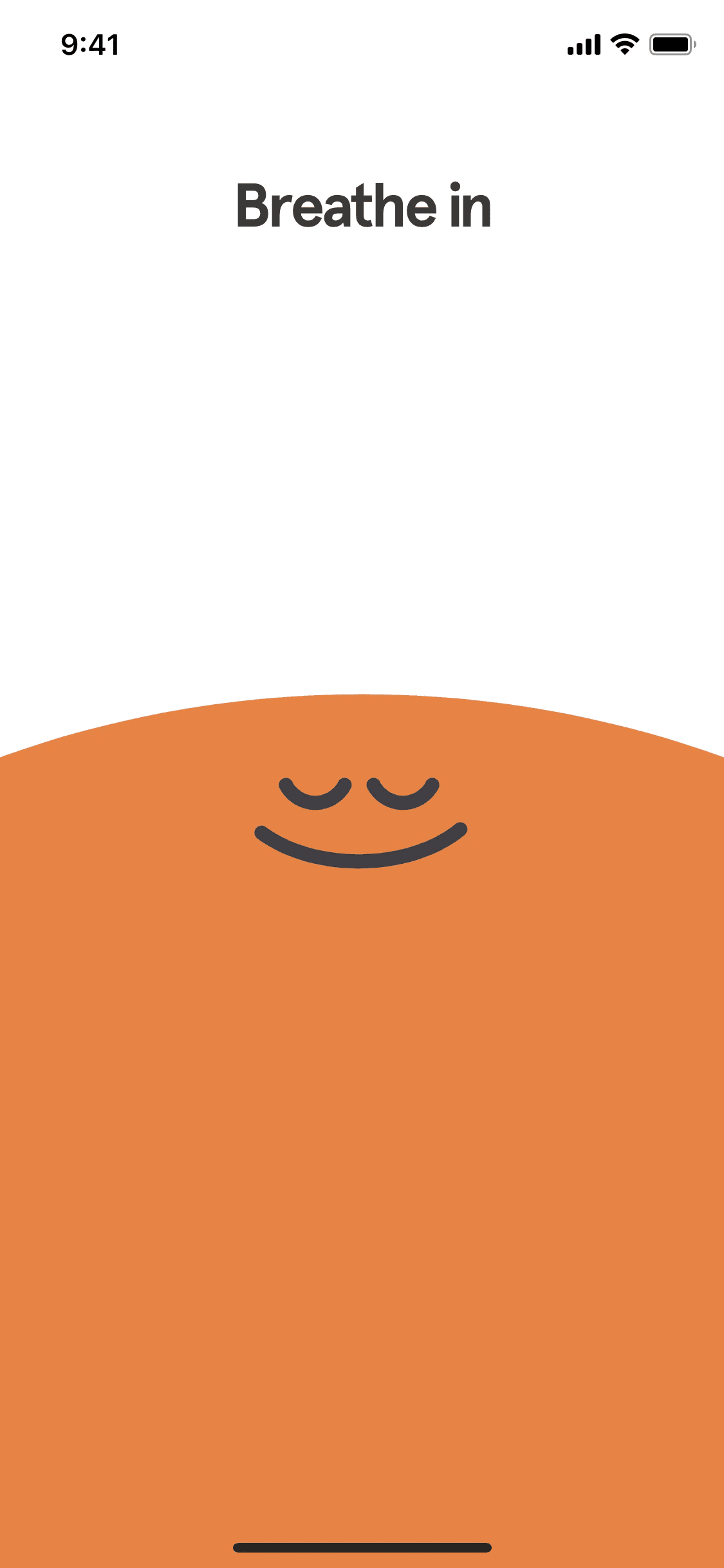
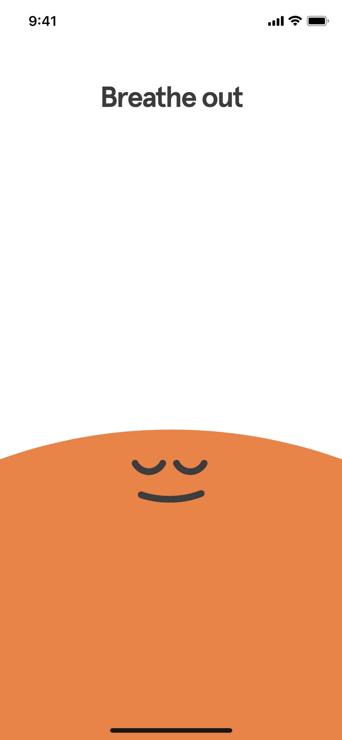
Directly showing health benefits as soon as you’re logged in, making the user want to use the app.
Easy and clear screen, quick to learn. Icons adhere to conventions
Clearly labelled and easy to understand, making the app simple to understand.
Directly showing health benefits as soon as you’re logged in, making the user want to use the app.
Easy and clear screen, quick to learn. Icons adhere to conventions
Clearly labelled and easy to understand, making the app simple to understand.
the solution
the solution
In order to solve the problem of the user’s overwhelming cognitive load while using the app, our team mapped the user’s journey, ideated on how to simplify this process and designed a prototyped solution.
In order to solve the problem of the user’s overwhelming cognitive load while using the app, our team mapped the user’s journey, ideated on how to simplify this process and designed a prototyped solution.
We came up with three actionable solutions:
We came up with three actionable solutions:
Simplify the user flow for the user’s first ever cold shower.
Improve the hierarchy and organization of the app's landing page.
Offer information on the health benefits of the challenge.
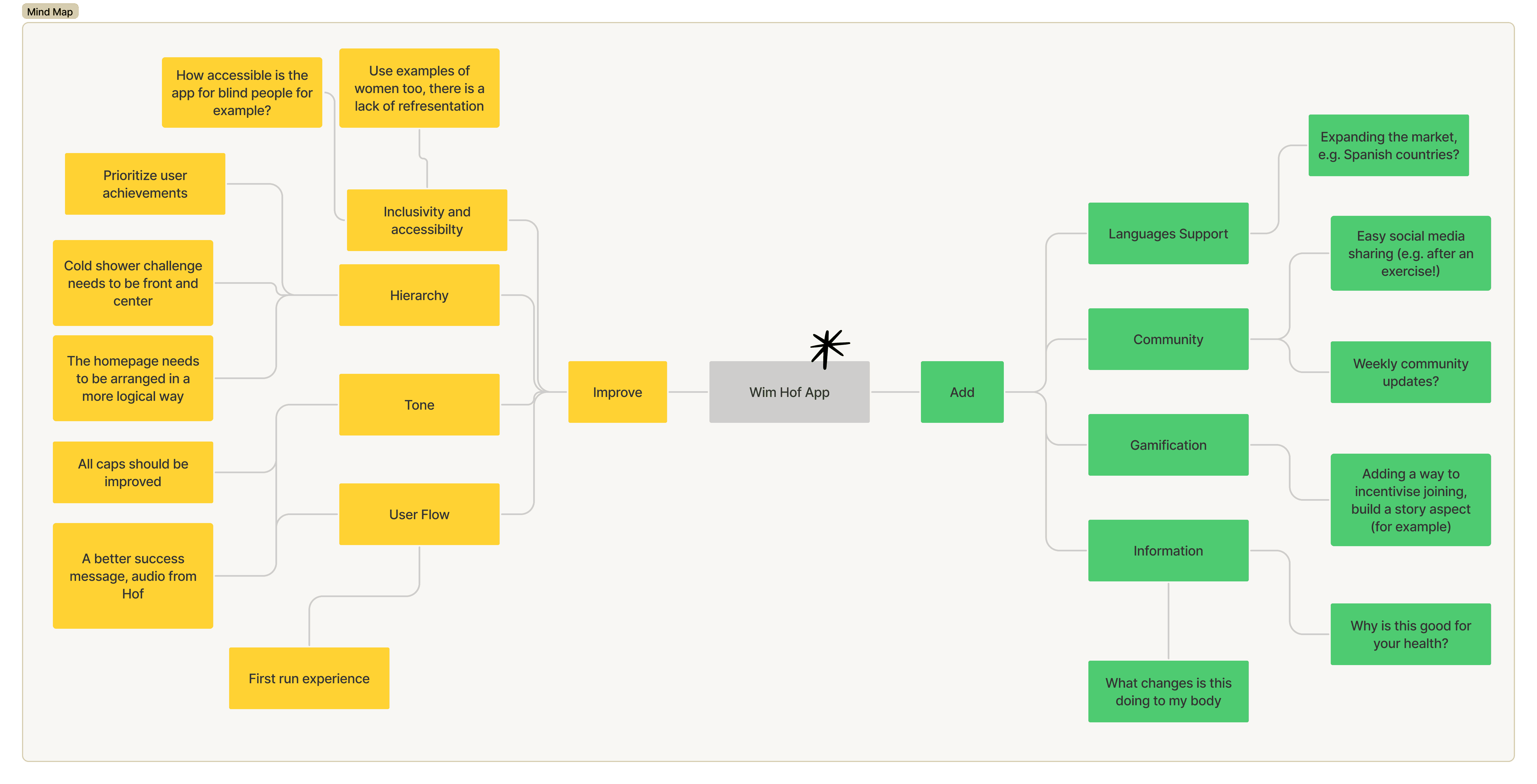
We conducted a mind map to better distinguish between needed features and nice-to-haves, as feature bloat was something that we were mindful of.
We conducted a mind map to better distinguish between needed features and nice-to-haves, as feature bloat was something that we were mindful of.
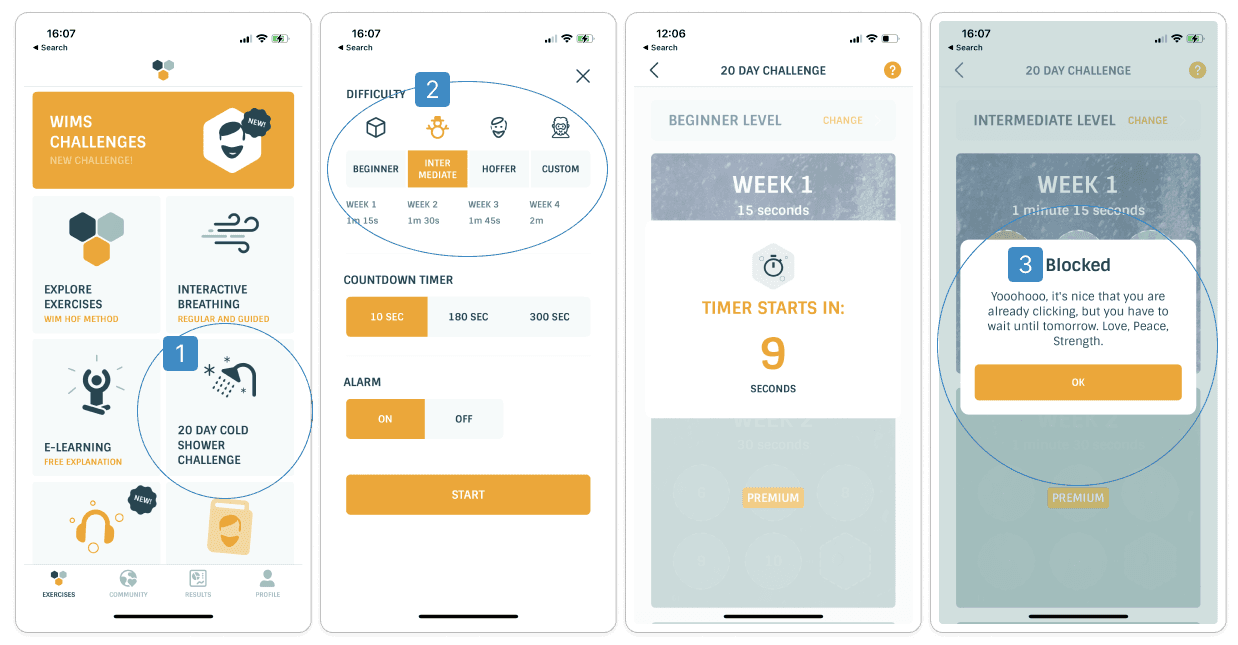
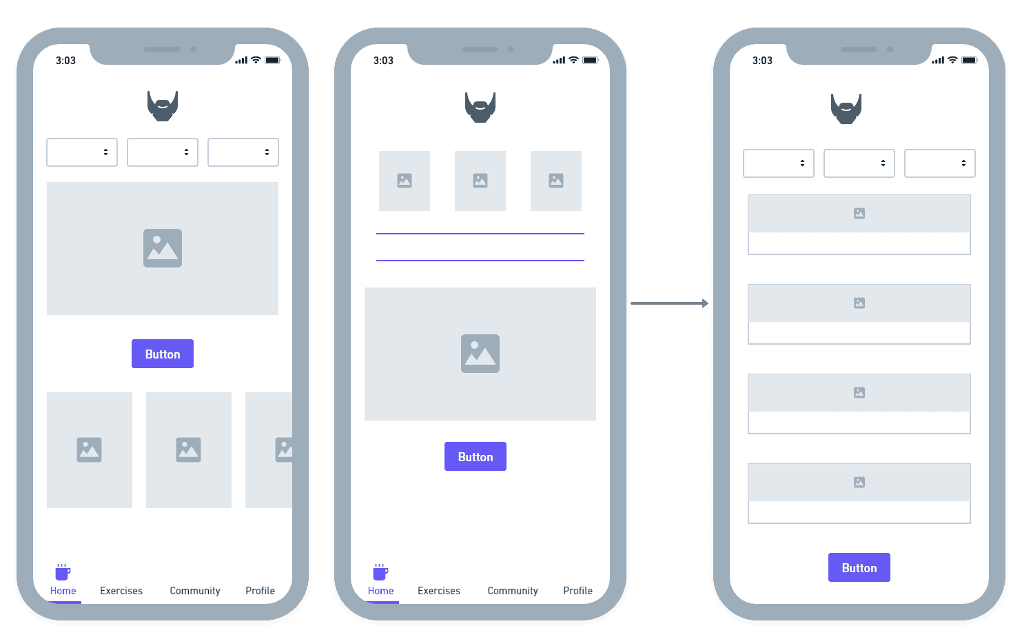
current user flow

The existing user flow had users set three different options for the shower manually: the difficulty level, the countdown timer and the alarm option. The countdown timer was vague and did not really communicate properly what it was about. Also, it did not offer the user a way to control the shower once it had started.
Improved user flow

The new and improved user flow embeds all of these options within the difficulty levels of the app, except for the alarm toggle, which is still set manually. It also offers the users an option to pause or stop the process, making for a more transparent and controllable experience.
current user flow
The existing user flow had users set three different options for the shower manually: the difficulty level, the countdown timer and the alarm option. The countdown timer was vague and did not really communicate properly what it was about. Also, it did not offer the user a way to control the shower once it had started.
Improved user flow
The new and improved user flow embeds all of these options within the difficulty levels of the app, except for the alarm toggle, which is still set manually. It also offers the users an option to pause or stop the process, making for a more transparent and controllable experience.
Simplify the user flow for the user’s first ever cold shower.
Improve the hierarchy and organization of the app's landing page.
Offer information on the health benefits of the challenge.
Wireframing the solution
Wireframing the solution
We focused most of our energy on improving the first time user’s cold shower experience, making sure that we are reducing the user's cognitive load in the process. We ideated on several solutions and finally landed on a version that offered the user preset timings and levels for their cold shower.
We focused most of our energy on improving the first time user’s cold shower experience, making sure that we are reducing the user's cognitive load in the process. We ideated on several solutions and finally landed on a version that offered the user preset timings and levels for their cold shower.
Our landing page also needed work with fixing the hierarchy of the information on the page and making the cold shower challenge prominent to first time users. We synthesized our ideas to create one variant:
Our landing page also needed work with fixing the hierarchy of the information on the page and making the cold shower challenge prominent to first time users. We synthesized our ideas to create one variant:
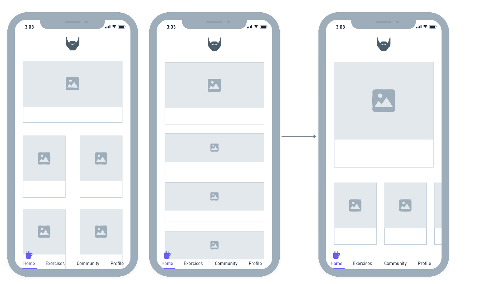
Our team also ideated on overhauling the overall look of the app and even wireframed possible solutions for integrating social media and a community feature.
Our team also ideated on overhauling the overall look of the app and even wireframed possible solutions for integrating social media and a community feature.
High fidelity prototype
High fidelity prototype
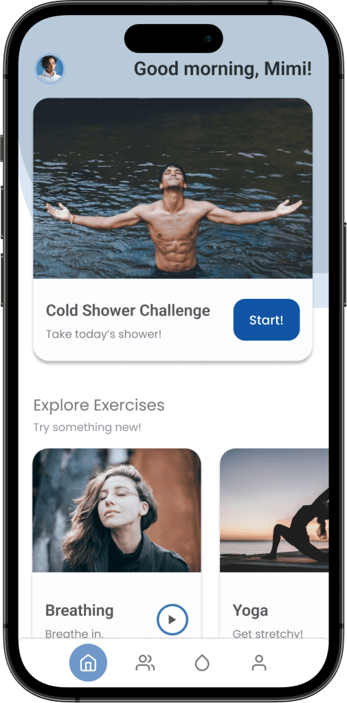
We redesigned the landing page to make the cold shower more prominent, making it easy for new users to start the challenge.
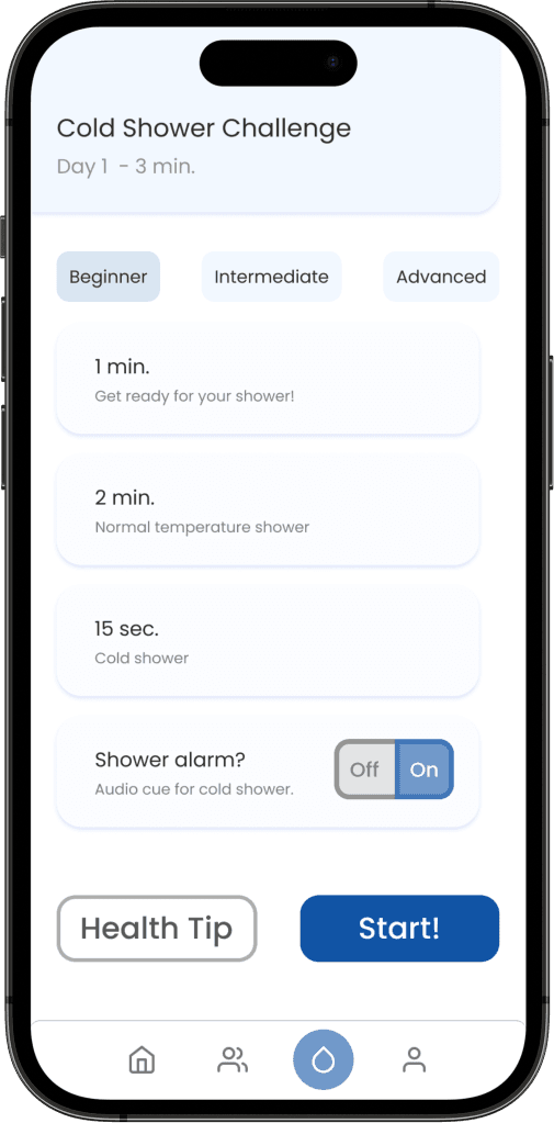
The cold shower settings settings are now preset, making it easier to start day one of the challenge and reducing cognitive load.
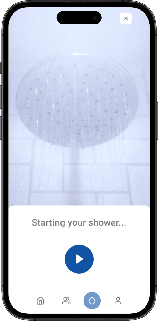
We added a play/pause button to make it easier for the user to control their shower, which should ease frustration.
We found that the app’s inconsistent color choice also affected the user’s mental load by affecting learnability, so we chose a harmonious blue to reflect the Wim Hof brand. We also chose fonts that are easy on the eye to reflect on the wellness aspect of the app.
We found that the app’s inconsistent color choice also affected the user’s mental load by affecting learnability, so we chose a harmonious blue to reflect the Wim Hof brand. We also chose fonts that are easy on the eye to reflect on the wellness aspect of the app.
We redesigned the landing page to make the cold shower more prominent, making it easy for new users to start the challenge.
The cold shower settings settings are now preset, making it easier to start day one of the challenge and reducing cognitive load.
We added a play/pause button to make it easier for the user to control their shower, which should ease frustration.
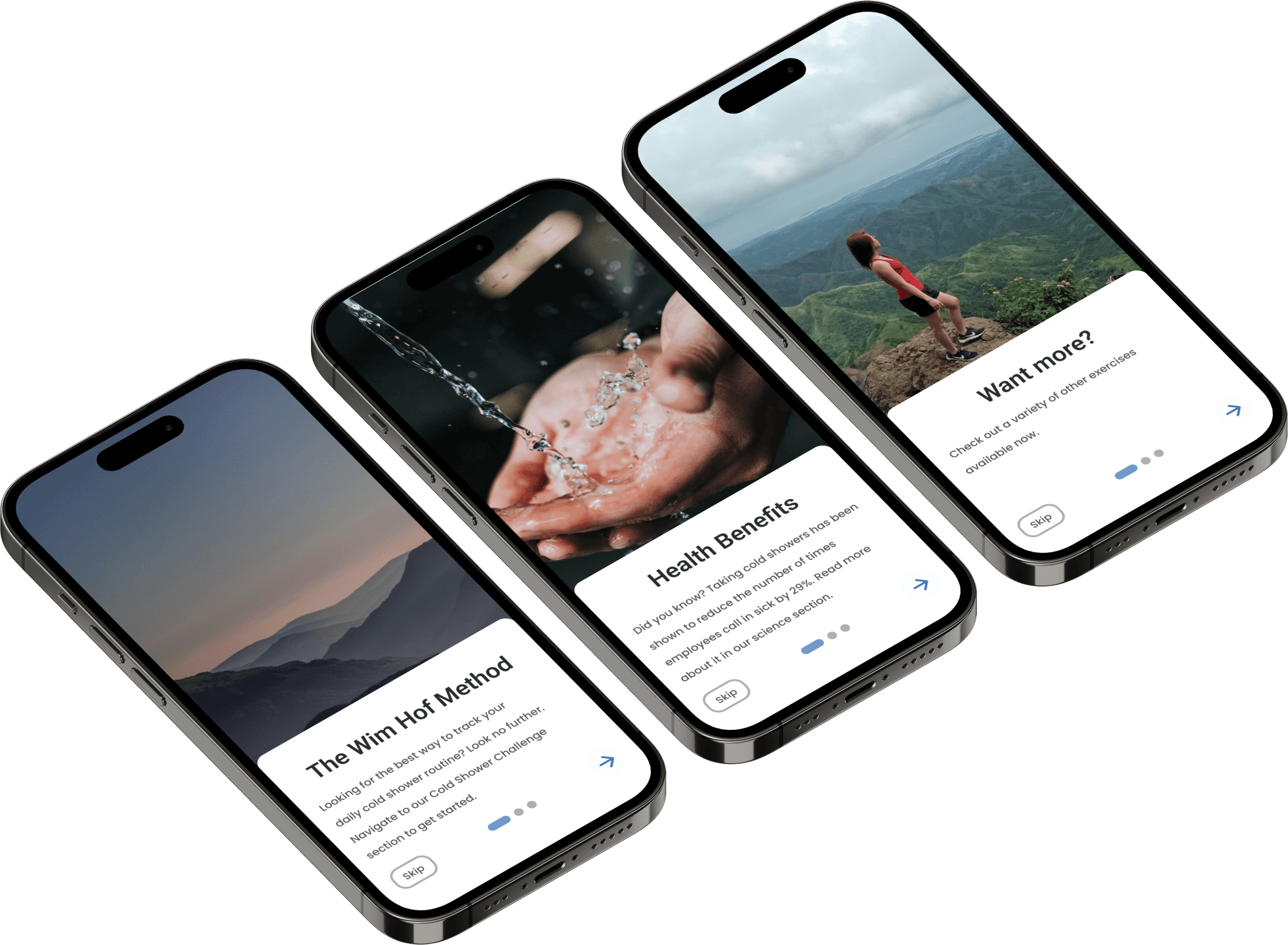
We simplified the onboarding page to show our users the most useful information on how the Wim Hof app can affect their health, which we believe would increase intrinsic motivation in our users.
We simplified the onboarding page to show our users the most useful information on how the Wim Hof app can affect their health, which we believe would increase intrinsic motivation in our users.

In order to reiterate the importance of informing our users about the health benefits of the app and fostering intrinsic motivation in this daily task, we decided to build in a button to show them health tips. Our users would be getting a different tip every day!
In order to reiterate the importance of informing our users about the health benefits of the app and fostering intrinsic motivation in this daily task, we decided to build in a button to show them health tips. Our users would be getting a different tip every day!
What's Next?
What's Next?
We would need to conduct some usability testing on the product in order to determine the impact of the changes that we implemented.
We wanted to add more gamification and social media features but due to the time constraint were not able to reflect these in our prototype.
We need to ideate on a solution for making it easy for our users to track their cold shower progress.
Key learnings
Key learnings
It is important to consider the user experience and its context in its entirety. When exactly is the user going to be using this product? It is important to get into the root of the user’s motivations for using the products that we design. It is our job as UX designers to relieve our users’ mental load as much as we can, especially on products that focus on their wellness.
Given more time and resources, it would have been even more effective to conduct more user research on what motivates the users of this particular product.
Regarding the UX workflow, this case study taught me personally about the importance of prioritizing and time management, especially when the problem spaces of the project seem to be huge and disconnected.